Showing posts with label Art Reviews. Show all posts

Saturday, May 31, 2014

Art Review: Mel Bochner, "Strong Language" and Dialogue and Discourse


Mel Bochner, 2008
I was thrilled to attend the event, Dialogue and Discourse: Mel Bochner and Norman Kleeblatt at The Jewish Museum to view and hear about Bochner’s new show, “Strong Language”, on exhibit until September 21, 2014. The show features Bochner’s distinctive and provocative text-based works that span his five-decade career. The dialogue and exhibition were both enlightening and inspiring and conveyed depth and insight into Bochner’s process, transitions and impact on Conceptual Art.

Norman Kleeblatt (L) and Mel Bochner (R)
The Jewish Museum, May 15th, 2014

The artist dialogue revealed the motivation behind Bochner’s ideas that often encompassed humor, intellectual representation, and his affinity for synonyms. What was even more revealing was Bochner’s body language. As he took the stage with Mr. Kleeblatt, Bochner shifted away from the spotlight cast upon him and moved his chair into the shadows. Needless to say, he could not escape the limelight and he brought subtle humor to his aversion of being the center of attention, which he richly deserves.

Bochner’s early works from the 1960’s were spawned from words, from the cerebral and the mathematical that are mindfully penned on graph notepaper. These early works can be easily connected to his recent paintings that are large scale, full of lush color, and inspired by language and the Thesaurus. His later works are divergent, but clearly an evolution of his earlier endeavors and accomplishments.

Self/Portrait, 2013, Oil on canvas
Curator Norman Kleeblatt began the dialogue with a new self-portrait Bochner created in 2013 to commence the exhibition appropriately titled Self/Portrait, 2013. For Bochner portraiture is representational (like language) and when you enter the gallery, you are enveloped with a large self-portrait that is exemplary of Bochner and his methods. This new work echoes a previous self-portrait created in 1966, which reads as a manicured, inked list on graph paper, rather than a painting. During the dialogue, he described how hard it would be to pick one word (and the synonyms) to describe himself as he did in his conceptual portraits in the late 60’s for friends like Eva Hesse and Marcel Duchamp. So instead he choose the ideas, the words, to embody the idea of the self-portrait.


Left: Portrait of Eva Hesse, 1966, Ink on graph paper Right: Portrait of Marcel Duchamp, 1968, Ink on graph paper

From the Exhibition: From 1966 to 1968 Bochner undertook a series of artists friends whom he admired. Each drawing refers to the creative work of the subject. The central concept WRAP is enclosed within eleven circles of words associated with the sculptor Eva Hesse. The concentric format reflects the circular motifs found in her sculpture at that time.

Photo from
Dialogue and Discourse: Mel Bochner and Norman Kleeblatt

The Jewish Museum, May 15th, 2014
The 1966 self-portrait was highly conceptual and now Bochner reinvents and transforms it into a fresh painting that looks like it was painted with sweeping drips of vanilla gelato with urban grit. His love for synonyms is on full display as the words Self and Portrait headline the composition and he creates two lists of synonyms that provoke questions about the idea of the portrait. However, when read across the words become phrases that take on new meaning, which Bochner frames as sometimes being evocative or just silly. He keeps the spine (empty Colum in center) in his work, which can be read as figurative and he deliberately has 18 words on display, which is symbolic and meaningful in Judaism. The number 18 is represented by the Hebrew letters חי, “chai” and means life in Hebrew. So there are “hidden” meanings in his composition and in relation to himself.  Bochner also revealed that the painting is as tall as he is. 

Panoramic photo of the exhibition at The Jewish Museum, ©Monica Hopenwasser
Bochner made the distinction that he doesn’t paint words–he paints letters!  Each one is hand painted, without a stencil but with a very steady hand, which he held up for the audience that laughed. Each letter is unique, from a dreaded S with all its curves to the letter O, which he exclaimed is a really hard letter to paint. Each O is different and you can see the subtle differences up close in his work. He makes lettering look easy, which it is definitely not. He also revealed that perhaps his father being a sign painter influenced his work and technique. There is no plan with the text and letter in his recent works. He looks at it as an “instant improvisation”, like going from note to note in a musical composition. For Bochner getting from the idea to the object entails much physical work that he stated as matter-of-fact. 

Crazy, 2005, Oil and acrylic on canvas
Bochner is very interested in words especially the idea of what a synonym is, which is a vehicle for his thoughts. Ironically, no words or phrases can mean the same thing and he bluntly stated, “there is no such thing as a synonym”.  Many of his Thesaurus inspired works from the past decade have one word titles like Contempt, Die and Nothing. Bochner's works explore the relationship between words and although his paintings are flat, at the same time they deny their flatness through his fluctuating, flickering colors that are arbitrarily chosen. Bochner stated some simple yet profound statements about color like “Color is, what color does” and “Color always means trouble… especially something you can’t control”… These concepts fascinate him. 

(Small) Fart, 2003, Oil and acrylic on canvas
His humor is on full display with his painting (Small) Fart, 2003 that was for his 8-year-old daughter. This sweet story was revealed when Bochner exclaimed to Kleeblatt and the audience... “Aren’t we going to discuss and show the Fart painting”, which generated a roar of laughter from the audience. Kleeblatt jested back that is it on display downstairs for everyone to enjoy and this opened up to the funny story of how the painting came about. Bochner gave his daughter the opportunity to choose a word and he would create a painting for her birthday. (On another note, he doesn’t really do commissions and paints for himself). She wisely picked the word Fart that is amusing and childish and can make anyone laugh.  


Jew, 2008, Oil on Canvas
Bochner’s sociopolitical side can be seen in his painting titled Jew, 2008 which was created in response to coming across a vulgar website that listed slanderous words and names for a Jew. He exploits these stereotypical words of the Jew in drippy, yellow letters that signify the yellow stars Jewish people were mandated to wear during Nazi rule in Europe. If this painting was not done by a Jewish person and featured in a Jewish museum the text could be read as offensive and malicious, rather than demonstrating that anti-Semitism is alive and well and living on the Internet. It is intended to have implications beyond the literal meaning of the words and one audience member contributed that she felt safe viewing it in the Jewish Museum. However, if it were somewhere else it could be read entirely differently.  

Photo from Dialogue and Discourse: Mel Bochner (L) and Norman Kleeblatt (R)The Jewish Museum, May 15th, 2014
Mel Bochner was a great guest in discourse with curator Norman Kleeblatt. The event was educational and illuminating in this beautifully conceived show. Bochner was genuinely interested in the audiences’ questions and Bochner stated that for him that was the best part of the conversation… Hearing what the audience had to say in relation to and about his work and how his work is perceived.  Bochner ‘s artwork and concepts can easily be introduced in to the art classroom because of the many cross-disciplinary connections that can be made to language and mathematics, as well as techniques to painting letters and color mixing. There are so many connections and teaching points that cane be generated from his approach and methods. There is more to learn and see at the show then the above mentioned. For example, how Bochner reinvents the idea of the reproduction and how he used photography in his early works. He was a gentleman and a true artist and this is a show surely not to be missed.

Wednesday, May 7, 2014

Neue Galerie, Degenerate Art: The Attack on Modern Art in Nazi Germany, 1937


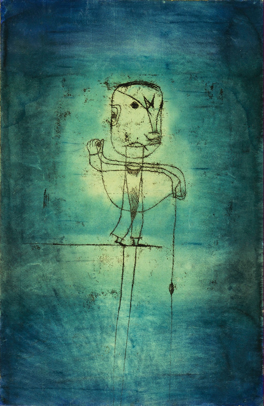
I have my own personal connection with WWII being the grandchild of Holocaust survivors and having had many cousins and extended family murdered, tortured and imprisoned during the war. Hitler was no stranger in my house and the very popular exhibition at the Neue Galerie exposes another horrid facet of the Nazi regime and its evolution of evil. The exhibitions focus is on how the Third Reich used art as propaganda to influence the public, manipulate power and demonize artists by dictating what was pure and acceptable in the world of art. The more abstract, simplified, raw or reduced the figure or landscape; the more pathological and sick the Nazi party deemed the art and artist. Artist Emil Nolde, a Nazi party sympathizer was labeled "degenerate" and modern artist Paul Klee was removed from teaching positions and driven in to exile because of his minimal, abstract paintings that were compared to the renderings of a child and were considered lacking and deficient.

Paul Klee, The Angler, Oil transfer drawing, watercolor and ink on paper, 1921

Vasily Kandinksy, Several Circles, Oil Paining 1926
Russian painter Vasily Kandinksy is one of my all-time favorite artists and his painting Several Circles was designated (surprisingly) "degenerate" and was on display at the exhibition. Other lesser known household names like Christian Rohlfs and Lasar Seagull were also labeled degenerate art by The Third Reich. To see these imaginative, diverse, rich and colorful artworks displayed together in one space and to witness the attack on Modern Art in Nazi Germany only validates the perverse evil the Nazi's embodied. Put on full display is The Nazi's intolerance and wickedness.

Christian Rohlfs, The Towers of Soest, Oil and Tempera Painting, 1916

Lasar Seagull, Eternal Wanderers, Oil Painting, 1919  

One room had a powerful display that juxtaposed artworks regarded as acceptable by the Nazi party on one side of the space, while the other side of the room showcased the degenerate art labeled by the Nazis. This coupling, in one space, clearly showed the distinct styles and differences in a blatant compare and contrast. Adolf Ziegler's, The Four Elements, (supposedly one of Hitler's favorite painters) is a triptych of the idealized female nude, reminiscent of the Romanesque woman with clearly "Aryan-like" features that mirrored racial Nazi ideology. The Nazi's liked this kind of art... technically proficient and emotionally flat.
 

Adolf Ziegler, The Four Elements, Oil Painting, 1937
 In the same room, to the right of Ziegler is another triptych by Max Beckmann titled Departure.
Max Beckmann, Departure, Oil Painting, 1933-35

According to the Museum of Modern Art, "...the elaborate narrative juxtaposes scenes of sin and salvation, but what makes the painting modern is the deliberate ambiguity of its iconography." The style of Beckmann's painting is raw and edgy with black, bold outlines and simplified forms and features that lend itself to the violent and emotional. This was rejected by The Nazi's and eventually Beckmann was fired from his professorship by the Nazi's and moved in to exile to The Netherlands.

Check out this engaging exhibition... The Neue Galerie is located at 1048 5th Ave, New York, NY and runs from March 13-June 30, 2014

Photographs are not allowed at the exhibition and the images included in this blog post were taken/sourced/found on the Internet.

Tuesday, March 18, 2014

Art Matters on the Lower East Side


Monica and Jean in front of Maya Hayuk's graffiti wall on Houston Street
There are a number of art galleries that pepper the streets on the Lower East Side and here are some highlights from my walk about with artist Jean Alexander Frater.

View at Frosch & Portmann Gallery
David Hayward, Untitled
2013
oil on panel
15 x 18 in

David Hayward, Untitled
2013
oil on panel
15 x 18 in

The Frosch & Portmann Gallery on Stanton Street is an intimate space that has a solo show featuring the oil paintings of David Hayward on display until April 6th, 2014. Hayward’s abstract paintings are left untitled to leave interpretation up to the viewer and depict a shape that embodies the panel. There is great use of positive and negative space in Hayward’s compositions that allude to nature and maps along with many other correlations that can be associated with his imagery. There is a tranquility in his work that is thoughtful yet informal and he strikes a gentle balance between his contrasting colors, textures and dominant shape. David Hayward is one to watch.

Jean observing Laura Watt's Crux Crucis Hermetica, 2013
oil on canvas
60 x 60 in
 
Laura Watt, Crossing
2014
oil on canvas
36 x 30 in


Laura Watt, Vector Finding
2014
oil on canvas
36 x 30 in

The McKenzie Fine Art Gallery featured large-scale paintings by Laura Watt that dazzled Jean and I with their hypnotic patterns that created rhythmic grid compositions with strong contrasting colors. When you read her press release it reveals her inspirations like comic book imagery and 1960s rock posters, which is evident in her psychedelic, vector formations that alter in shape and scale. Her works are dynamic and her technique is dutifully mastered as she constructs pulsating patterns with dexterous line work that demonstrates her talent and deft hand.
 
Rusty Shackleford, Slick Shoes
2013
C Print
36 x 29 in

Gallery view of original magazine images after they are placed on scanner by Rusty Shackleford.

The spacious Cindy Rucker Gallery on Attorney Street had a solo show titled Repeater by Chicago based artist Rusty Shackleford. His works are comprised of magazine papers that are obscured by paint applications and are further altered by being smashed on his scanner that generates a work of art created by chance. The final result is an enlarged digital print that is the result of his process and produces works that are unpredictable and random. I like the process of combining digital tools and fine art talents, but I was less impressed with the final results that sometimes felt incomplete and at times disconnected to the magazine image itself. Some prints were stronger than others with paint smudges and splats that spontaneously integrated. There are some great ideas and techniques in Shackleford's work, but the work can be further developed to speak to the artists statement and have more visual appeal.


Lucy Kim
Your Nose Is My Nose (1)
2014
oil paint, various plastics, spray paint on wood panel
20 x 16 in


Lucy Kim
Your Nose Is My Nose (2) 2014
oil paint, various plastics, spray paint on wood panel
20 x 16 in

The Lisa Cooley Gallery had a group show that recently closed titled We play at paste, which gets its title from an Emily Dickinson poem. Lucy Kim was one of the artists in the show and I enjoyed her 3-Dimensional works that featured molds of various mouths and noses composed on wood panels that read as playful and pliable in their asymmetrical arrangements. In Your Nose Is My Nose (1), Kim's use of space and color creates profile images that are subtle and complementary to her 3-D forms and does not overwhelm the background. In her second panel the ribbon-like lines that surround the features conjure up the idea of deflated balloons and prompts comparisons to what it is to be a child and/or adult.

Sunday, March 16, 2014

Arting Around in Chelsea, NYC

Winter may be overstaying its welcome, but the New York art scene is flourishing with some big shows in March like The Whitney Biennial and The Armory Show. The talented Chicago based artist Jean (aka Jenny and Jen) Alexander Frater came to New York City to visit and tour the art scene the first few days of March and we became art nerds. 
Jean's commitment and passion for her art making is infectious, as well as her desire to seek out art and artists that awe and inspire. We explored some Chelsea and Lower East Side galleries and got to attend the very popular Whitney Biennial opening reception, which was the culmination of our time together. Here are my highlights of artists and impressions from our art expedition in Chelsea. More to come soon about the LES and Whitney Biennial! 


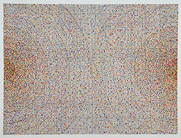
Richard Kalina, Signal, 2012
watercolor and ink on paper
22.5 x 30 in
Jean at the Lennon, Weinberg Gallery

Richard Kalina is exhibiting new paintings and watercolors at the Lennon, Weinberg Gallery  and this was my first time seeing his work up close and personal. I am attracted to his process and final abstract results that can be associated with many different ideas and concepts in science and nature.  The titles of these recent works refer to Mathematics and The Sciences, however, do not expect literal representation;  but rather playful and colorful constructs that are repetitive and harmonious in shape, line and color.  I particularly like his watercolor and ink on paper creations. They are simple yet complicated with obsessive lines and sporadic squares of color. The geometry of the piece possesses a meditative quality that simultaneously feels both spontaneous and contained. Kalina also has some new collage works that use the raw canvas as part of the composition along with colorful painted pieces of rice paper assembled in celestial-like arrangements utilizing shape and color to drive the piece.


Valerie Jaudon
painting at Stux Gallery

Valerie Jaudon, close-up of painting

Next door, we discover Valerie Jaudon's paintings (who is married to Kalina, who knew?) who is part of a group show at the Stux Gallery titled ….if Winter comes, can Spring be far behind?  The eclectic group show pays tribute to the coming of Spring and ushers in some fresh, contemporary works. Jaudon ‘s paintings are an intersection between modern Sanskrit and Keith Haring with buttery brush strokes that add texture to her crisp lines and patterns. Simple and strong, her paintings are bold designs with a neutral palette and create a modern language of their own.
Kathy Ruttenberg
Narcissist

2014
Ceramic
18 x 7.5 x 7.5 in
I also fancied this ceramic sculpture by Kathy Ruttenberg that is mythical and fairy-tale like with animal imagery intertwined with the figure. 


Nicole Charbonnet
Erased Riley (No 16)

2013
Mixed Media on canvas
60 x 48 in

Nicole Charbonnet, Gallery View
 Nicole Charbonnet is a New Orleans based artist who has a solo exhibition titled Erased at the Winston Wächter Fine Art Gallery. The richly textured and worn surfaces are layered with many additive and subtractive techniques and materials to expose imagery beneath linear patterns that evoke ideas of past and present, memory, and erosion. Many of her weathered planes are atmospheric and colorful while others use limited palettes and evoke structural, raw decay. I observed Charbonnet’s mixed media works without reading about her intent and later read her press release that was illuminating and gave more breadth to her work like how she appropriates imagery from other artists. Check it out here to learn more.


Richard Serra’s exhibit of free standing weatherproof steel plates titled Intervals at Gagosian Gallery is maze-like and
-->
magnanimous. Several layouts exist in the gallery and the material and arrangements of the structures could conjure up many associations, but I couldn’t help associate repression and captivity as I moved throughout the space. I did not read about Serra's ideas behind the conceptual installation... All I could feel is isolation amidst the walls created by these monumental slabs. I became a prisoner in Richard Serra’s artwork or it could be seen as a game of hide and seek. This exhibit concluded on March 15th, 2014.


Ran Hwangs: The Snowfall of Spiders at the Leila Heller Gallery is beautifully crafted and magical with 3D works that use buttons, beads, pins and projections to create cherry blossoms tree branches and nature inspired designs that nod to Zen Buddhism.  When you walk in the gallery you enter a magical space that shimmers with reds, pinks and blues that create captivating works of art with unconventional materials. It closes on March 21st, 2014 the day after we celebrate Spring, so catch it before it ends like Winter.

Wednesday, February 5, 2014

Contemporary Artists for Inspiration, Art Center of South Florida


In the middle of the frenzied promenade on Lincoln Road in SoBe Miami lies the Art Center of South Florida that offers classes, studios and residencies for Contemporary Artists. Every first Saturday they have open studios where you can discover emerging and established Contemporary Artists. To learn more about the residency program, which has three application deadlines per year, click here.

There were three very different artists whose work I enjoyed and want to share that can easily be introduced in art lessons and the classroom. These artists-in-residence evoke the often taught works of Edward Hopper, David Hockney’s collages and Andy Warhol’s pop art. I think it is important to enhance the teaching of representative artists of their respective movements by exposing students to living, breathing artists that have talent and an engaging aesthetic. Keep your lessons fresh and mix it up; there is a world of practicing artists waiting to be recognized and discovered that are worthy of our attention. Check out these artists and see how they may tie in to your curriculum.

In Search of French Broad Sweets
Oil on Canvas, 60"H x 72"W
This is a scene from Asheville, North Carolina
by John Sanchez
John Sanchez is a talented American artist originally from New Jersey who draws and paints scenes of everyday life like parking lots, interiors of markets and cars on the road (to name a few) in dark umbers and siennas with contrasting light that creates a dramatic effect. His technique has expressionistic strokes with a realistic aesthetic that captures the fleeting moments in life with depth and subtle detail. His artwork can be connected to themes like documenting scenes in everyday life that capture transit and automobiles, travel and landscape, which are all relevant when teaching perspective, various painting techniques and how to use color to a create mood in a composition.

Tom Cocotos’s collage work is unique, beautifully executed and intriguing with its materials and subject matter. I love mixed media and collage work and it isn’t easy to successfully integrate materials and develop an original aesthetic and Mr. Cocotos exceeds with his masterful use of white space that poetically balances his compositions. He does a lot of commission work that involves portraiture and some of his portraits incorporate text that pertains to the person and creates subtle meaning in his work. His recent collages are inspired by the bees that flit about (and unfortunately die) in his studio space in Miami and he is intrigued by the complicated insects that are fuzzy, intricate and strong yet delicate at the same time, like much of his artwork. He incorporates carefully torn pieces of paper and found objects into his bee subjects that lends to abstraction and can be associated to collage artists who have left their mark like Kurt Schwitters, David Hockney and Joseph Cornell. Mr. Cocotos’s collage works have valuable teaching points and could inspire an art lesson that integrates the study of nature and insects with collage techniques that explore materials.

WI-FI in the Afterlife Jim Morrison
Acrylic & Transfer on Wood
47"H x 36"W
by Alejandro Vigilante

Finally, another contemporary artist that is revisualizing the theme of pop art is Alejandro Vigilante. He is a Miami-based multimedia painter who is in the process of developing a new strain of Neo-Pop art, loosely titled "i-Pop" or sometimes referred to as "iArt", as stated on his website. His artwork can be linked to technology and social media and pop culture icons that transcend time. He appropriates images that are saturated with color and have a pixel-like composition that mimics the technology he is borrowing from. Instead of just teaching about Andy Warhol when it comes to Pop Art and iconic images, check out Mr. Vigilante’s creations that take the theme further with today’s social media buzzwords and formats. There are many disciplines Mr. Vigilante’s work can be linked to like learning image-editing software like Adobe Photoshop, the history of Pop Art, and the ins and outs of Copyright Law and Creative Commons Use.